
Parents do not open a school portal to admire how many modules it contains. They open it to answer a question or complete a task: Was my child marked present? What is due? Has homework changed? When will the bus arrive? Where is the latest result or notice?
A useful parent portal brings those answers together without making families understand the school’s internal structure.
Build one trusted starting point
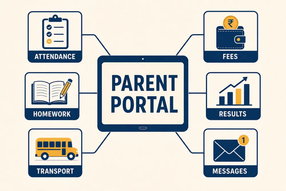
The portal should provide a simple overview of the information parents use most: attendance, fees, homework, results, transport, and official messages. Families with more than one child need an obvious way to switch context without signing into separate accounts or confusing one learner’s information with another.
Keep urgent actions distinct from general updates. A fee due tomorrow, an unread timetable change, and a newsletter should not compete with equal visual weight.
Show current status and next action
Every important card or page should answer three questions: What is the current state? When was it updated? What can I do next?
For fees, show the amount due now, due date, previous payments, and receipt access - not only an annual total. For attendance, distinguish present, absent, late, and not yet recorded. For homework, show the subject, due date, teacher instructions, and relevant attachment. For transport, display the assigned route and useful trip updates without revealing other students’ details.
Make official communication findable
Parents should be able to return to an announcement after it disappears from the home screen. Use consistent categories, dates, sender context, and search or filtering where volume justifies it. Clearly label notices that require acknowledgement or action.
A connected communication workflow can target messages using current class, campus, or route information. This is more dependable than expecting families to monitor several informal groups.
Design for real household conditions
Assume many parents will use a phone, sometimes on a slow connection, between other responsibilities. Prioritise quick loading, readable type, clear buttons, and modest image sizes. Do not make a large PDF the only way to understand a short notice.
Use plain language and consistent terms. If the school calls the same event an assessment, test, and exam in different places, the portal transfers internal confusion to families. Where the school serves multilingual communities, decide which high-priority content needs translation and who approves it.
Make problems recoverable
Account recovery is part of the parent experience. Define how a guardian updates a phone number, resets access, reports an incorrect child association, or requests help without sharing sensitive information in an open channel.
Show useful error messages. “Payment received, confirmation pending” is better than displaying an unexplained failure. If data has not yet been published, say so rather than showing an empty page that appears broken.
Protect privacy by default
A guardian should only see the students and information they are authorised to access. Review how custody or guardian changes, withdrawn students, alumni transitions, and staff accounts are handled. Sensitive academic, behavioural, or financial information should not appear in notifications visible on a locked screen unless the school deliberately approves it.
Explain what information the portal uses and provide a route for corrections. Trust grows when families understand what is official and how errors are resolved.
Connect the portal to school operations
A portal is only as reliable as the systems behind it. Attendance, fees, assessment results, and transport status need clear owners and publication rules. Parents should not become the people who discover that two departments hold different records.
Set service expectations for questions submitted through the portal. Route academic, fee, transport, and technical issues to the right team and tell the parent when a response is expected.
Test with families, not only staff
Invite a small, varied parent group to complete common tasks without guidance. Include families with multiple children, older phones, different levels of digital confidence, and more than one guardian.
Observe whether they can find a due amount, locate a notice, view a result, understand an attendance status, and recover an account. Their hesitation will reveal problems a school administrator may no longer notice.
Parent-portal readiness checklist
- The home view prioritises current status and required actions.
- Multiple children are easy to distinguish.
- Dates, update times, and publication states are clear.
- Official messages remain searchable and accessible.
- Pages work well on phones and constrained connections.
- Recovery and contact-detail changes are safe and understandable.
- Privacy follows guardian and role permissions.
- Questions route to accountable school teams.
- Families participate in usability testing.
Scholva’s parent and student portals connect families to the workflows they already depend on, without requiring them to navigate the school office. Request a demonstration to test the experience using real parent questions.
Related reading: School communication app vs informal group chats and Parent self-service reduces school office calls.